When we started this work 7 years ago, we were lucky enough to have Taqi Spateen design our logo. Taqi is a Palestinian artist from Bethlehem who is known for his painting and graffiti art. The logo he designed included an olive tree, a sunbird, and a key which represents the right of return.
Why the new logo?
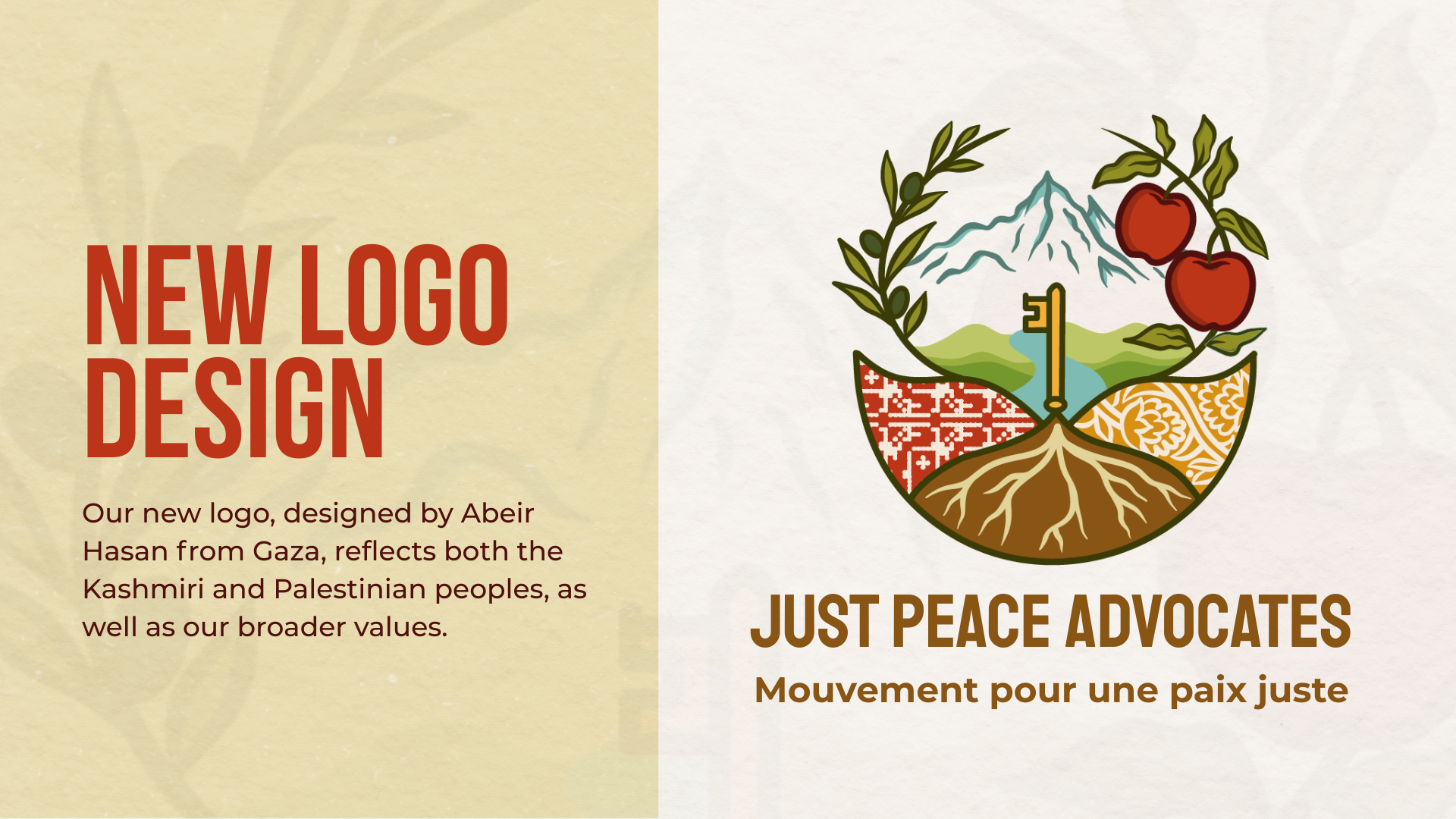
Just Peace Advocates began solely focused on Palestine, but quickly expanded to include Kashmir. Our focus is on the realization of the self-determination of the people of Kashmir and Palestine. More broadly, our work is rooted in anti-imperialism, decolonization, and the struggles of peoples oppressed by colonial systems globally. Therefore, we wanted a new logo to represent both the Kashmiri and Palestinian peoples, as well as these broader values.
What does the new logo represent?
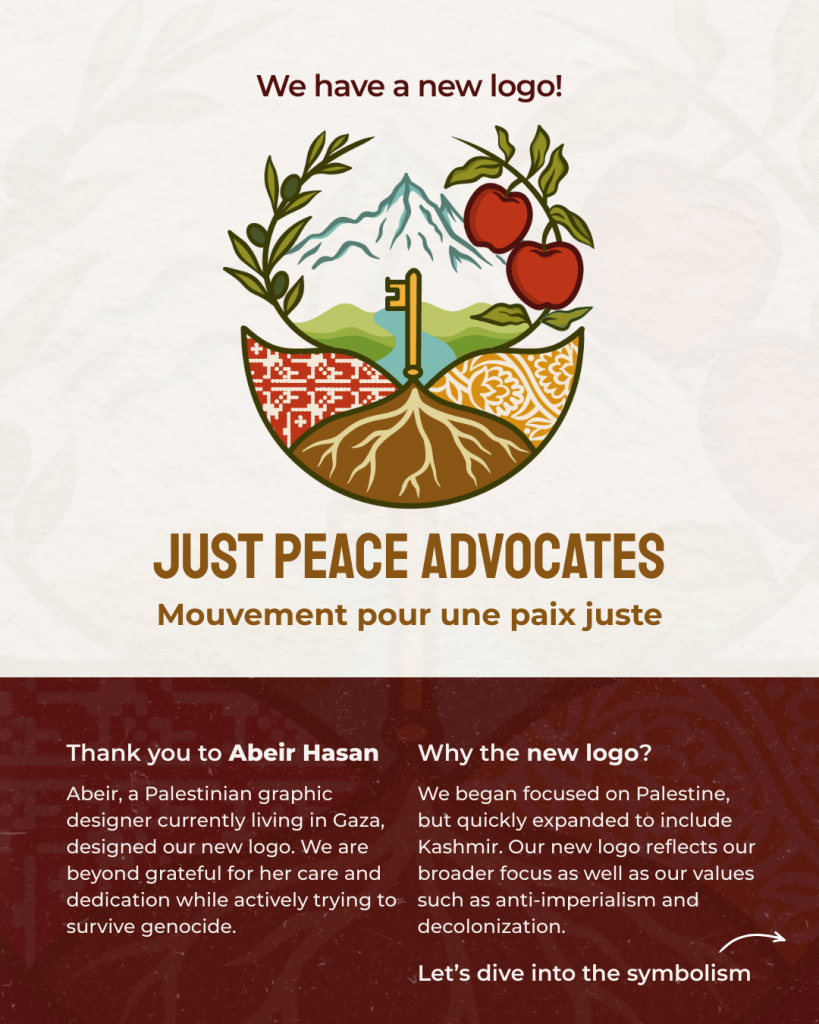
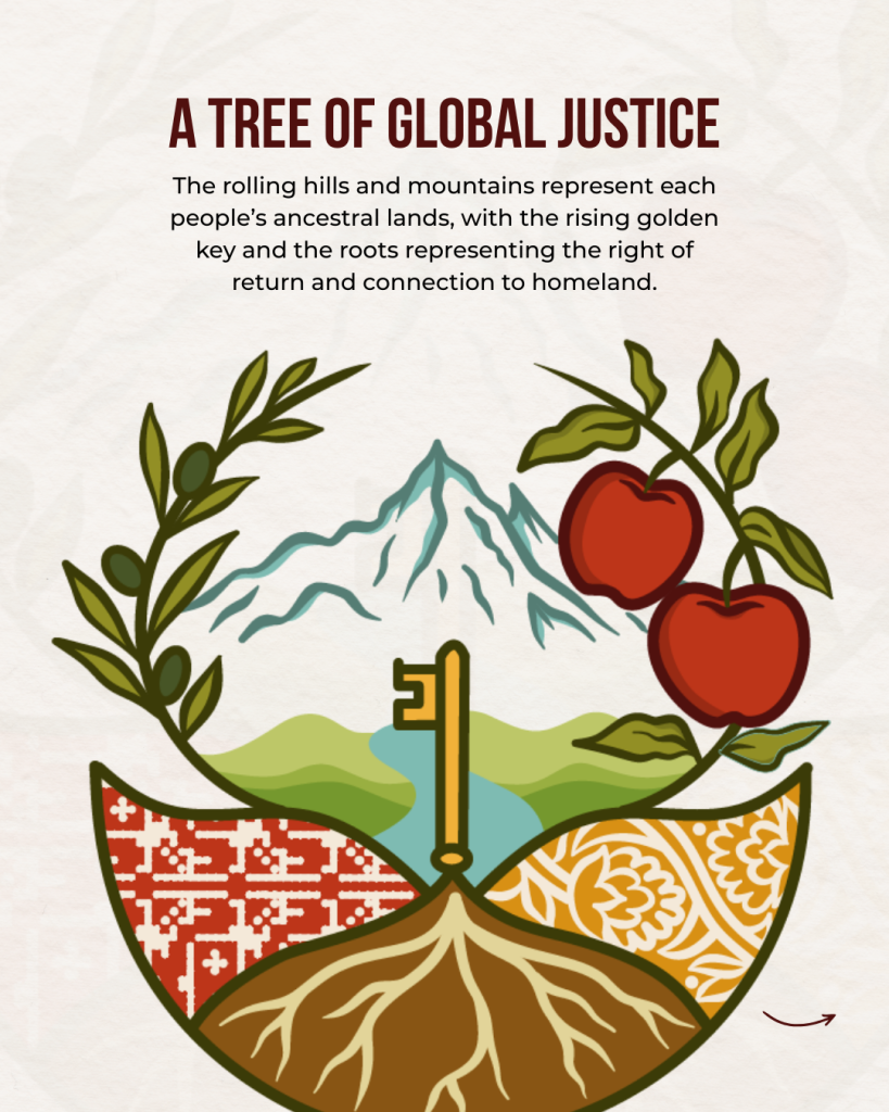
You will notice that there are two sides of the logo, connected by nature and deep roots. The left side represents Palestine and the right side represents Kashmir. While these two are separate and distinct, they are also connected. Both the Palestinian and Kashmiri peoples are under occupation by settler-colonial states. And both the Palestinian and Kashmiri peoples have long histories of resisting the occupation government’s with steadfastness as Indigenous peoples on their land. Therefore, they are connected by similar struggles against colonialism.
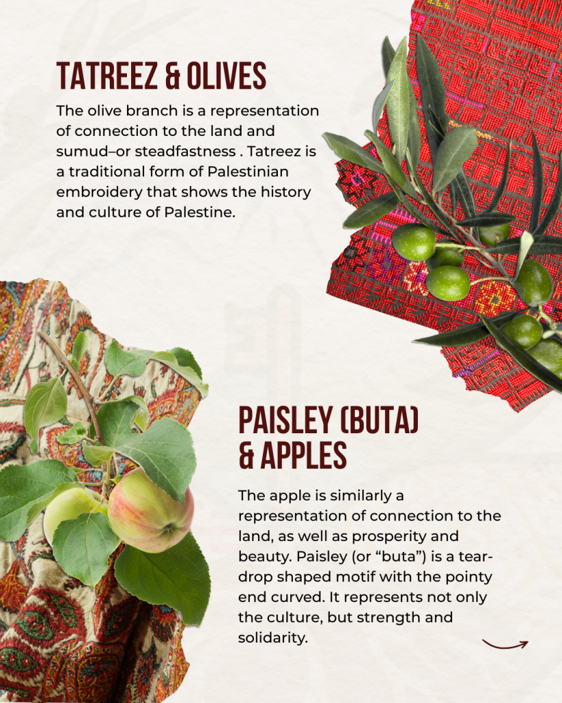
On the left side, representing Palestine, the logo includes an olive branch above a geometric shape filled with a tatreez pattern. The olive branch is a representation of connection to the land and sumud—or steadfastness. Tatreez is a traditional form of Palestinian embroidery that shows the history and culture of Palestine.
On the right side, representing Kashmir, the logo includes an apple branch above a geometric shape filled with a paisley pattern. The apple is similarly a representation of connection to the land, as well as prosperity and beauty. Paisley (or “buta”) is a tear-drop shaped motif with the pointy end curved — here, a common pattern within a paisley design is used. It represents not only the culture, but strength and solidarity.
The grasslands, rivers represent the vast landscapes of Palestine and Kashmir. The rolling hills on the left represent Palestine, while the mountains on the left represent Kashmir. Again, while distinct, they are connected.
Finally, the key arising from the roots represents the right of return and the connection of the Palestinian and Kashmiri peoples to their homeland. The roots represent the tree of justice — an idea shared by Robert Massoud. Palestine and Kashmir is at the root, “but the tree is global justice.”
Who designed the logo?
This new logo was designed by Abeir Hasan, a Palestinian graphic designer currently living in Gaza. We are beyond grateful to her for her care and dedication to creating something deeply meaningful, while actively trying to survive genocide.
French:
Lorsque nous avons commencé ce travail il y a 7 ans, nous avons eu l’occasione que Taqi Spateen conçoive notre logo. Taqi est un artiste palestinien originaire de Bethléem, connu pour ses peintures et ses graffitis. Le logo qu’il a conçu comprend un olivier, un souimanga et une clé qui symbolise le droit au retour.
Pourquoi un nouveau logo ?
Mouvement Pour une Paix Juste s’est d’abord concentré uniquement sur la Palestine, mais s’est rapidement étendu au Cachemire. Notre objectif est la réalisation de l’autodétermination des peuples du Cachemire et de Palestine. Plus largement, notre travail est ancré dans l’anti-impérialisme, la décolonisation et les luttes des peuples opprimés par les systèmes coloniaux à l’échelle mondiale. Nous avons voulu donc un nouveau logo qui représente à la fois les peuples cachemiris et palestiniens, ainsi que ces valeurs plus larges.
Que représente le nouveau logo ?
Vous remarquerez que le logo comporte deux parties, reliées par la nature et des racines profondes. La partie gauche représente la Palestine et la partie droite représente le Cachemire. Bien que ces deux régions soient distinctes et séparées, elles sont également liées. Les peuples palestiniens et cachemiris sont tous deux sous occupation par des États coloniaux. Et les peuples palestiniens et cachemiris ont tous deux une longue histoire de résistance à l’occupation, avec une détermination sans faille en tant que peuples autochtones sur leur terre. Ils sont donc liés par des luttes similaires contre le colonialisme.
Sur le côté gauche, représentant la Palestine, le logo comprend une branche d’olivier au-dessus d’une forme géométrique remplie d’un motif tatreez. La branche d’olivier symbolise le lien avec la terre et le sumud, ou la détermination. Le tatreez est une forme traditionnelle de broderie palestinienne qui reflète l’histoire et la culture de la Palestine.
À droite, représentant le Cachemire, le logo comprend une branche de pommier au-dessus d’une forme géométrique remplie d’un motif paisley. La pomme représente également le lien avec la terre, ainsi que la prospérité et la beauté. Le paisley (ou « buta ») est un motif en forme de larme dont l’extrémité pointue est courbée. Ici, un motif courant dans le design paisley est utilisé. Il représente non seulement la culture, mais aussi la force et la solidarité.
Les prairies et les rivières représentent les vastes paysages de la Palestine et du Cachemire. Les collines ondulantes à gauche représentent la Palestine, tandis que les montagnes à gauche représentent le Cachemire. Là encore, bien que distinctes, elles sont liées.
Enfin, la clé qui émerge des racines représente le droit au retour et le lien des peuples palestiniens et cachemiris avec leur patrie. Les racines représentent l’arbre de la justice, une idée partagée par Robert Massoud. La Palestine et le Cachemire sont à la racine, « mais l’arbre est la justice mondiale ».
Qui a conçu le logo ?
Ce nouveau logo a été conçu par Abeir Hasan, une graphiste palestinienne vivant actuellement à Gaza. Nous sommes extrêmement reconnaissants pour son attention et son dévouement à créer quelque chose de profondément significatif, tout en essayant activement de survivre au génocide.